Case Study: NBL Brisbane Bullets City Flag Jersey Concept
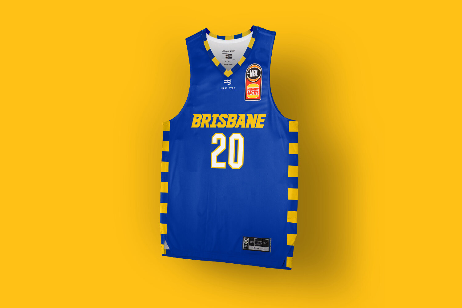
Flying the flag for Queensland’s capital. Before starting the research for this project I had no idea what the Brisbane flag looked like.
Flying the flag for Queensland’s capital.
Before starting the research for this project I had no idea what the Brisbane flag looked like. Turns out it is one of the most unique flags in Australia, with no tired visual ties colonial flags.
Theres a couple odd elements in it, hello pretzels, but the colour palette and patterning is so fresh and striking we had to try incorporate into a City jersey concept.
Throughout the process multiple wordmark variations were explored, from simple and robust modern sport, to fast with a bit of throwback edge, but the flag trim was a mainstay having it utilised in various combinations of type and base fabric colours.
While the flag colours are a perfect match for the teams brand identity, ultimately this was a little too close for what the club was looking for.
Wanting to offer something more unique in an alternate colour palette for the supporters who already own so many blue, yellow and white basketball jerseys, we eded up going down the route of the black and white Skyline uniforms. Check out the link below.
Case Study: NBL Sydney Kings Blackletter Jersey Concept
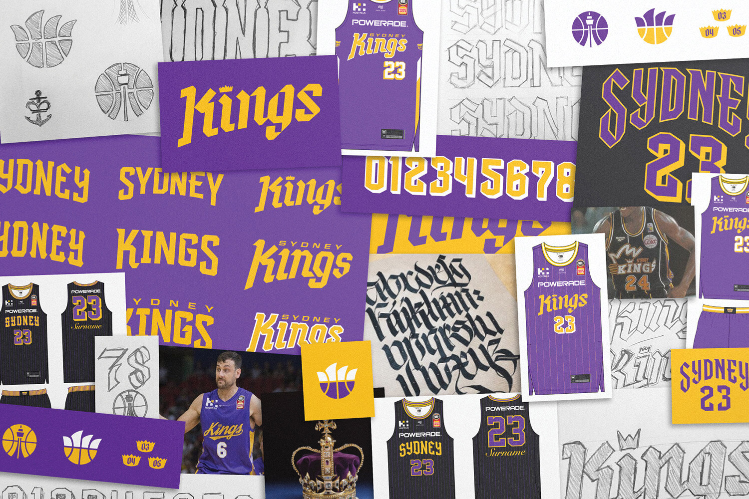
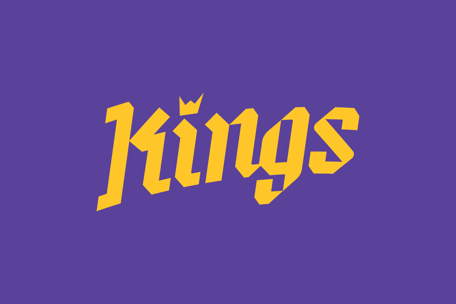
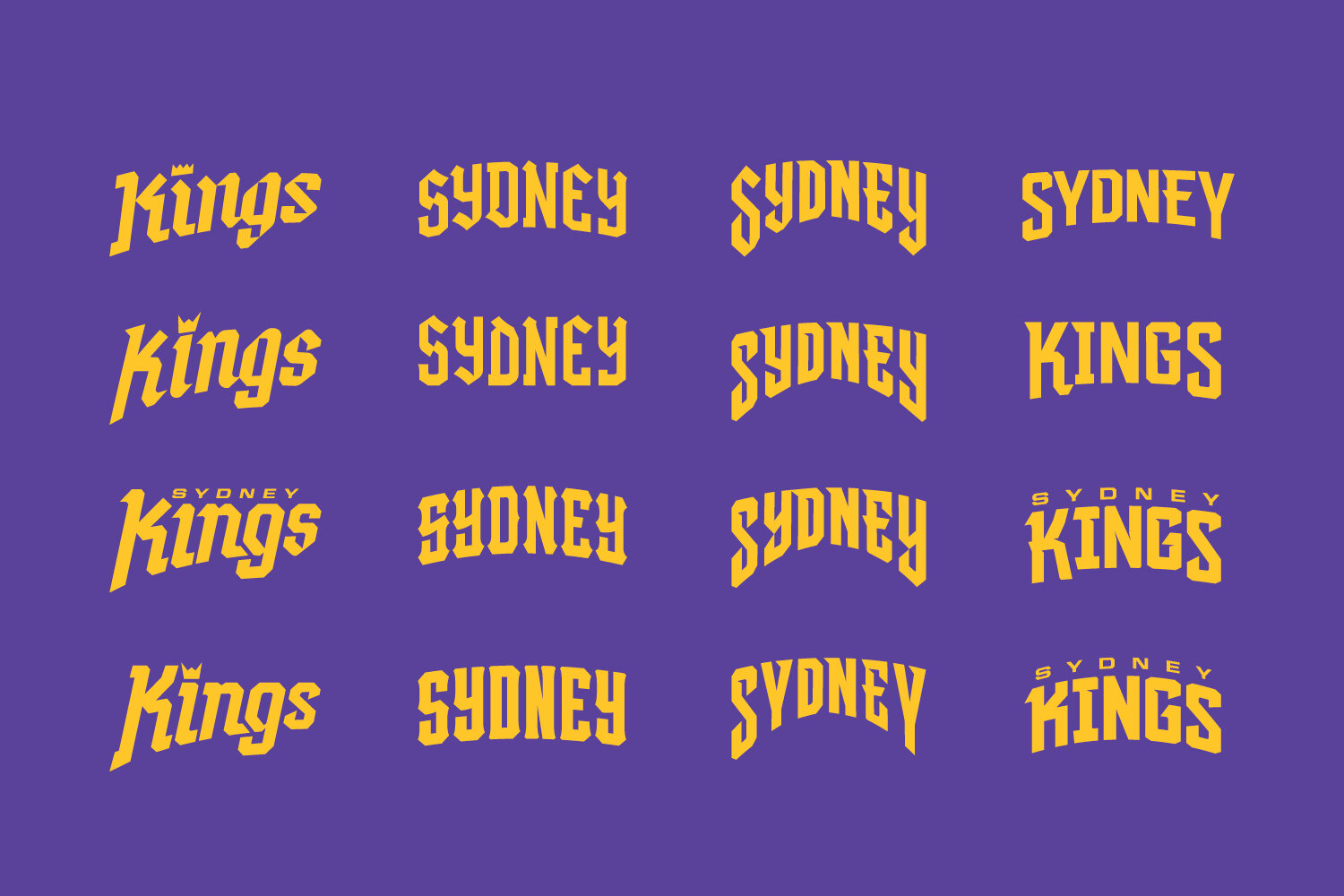
Early in the design process for the NBL 20 uniforms we identified potential for the Sydney Kings uniform design to amplifies the ‘Kings’ part of their brand identity, and develop typography which would be fairly unique in the global sporting landscape.
Heading to battle with the Sydney Kings and blackletter inspired uniforms.
Early in the design process for the NBL 20 uniforms we identified potential for the Sydney Kings uniform design to amplifies the ‘Kings’ part of their brand identity, and develop typography which would be fairly unique in the global sporting landscape.
The name Kings evokes such a rich reference palette of medieval ideas, battles, ruling lands, extreme wealth, sword fights and black letter typography.
Admittedly theres a danger if not properly executed it could resemble a LARP guild more than a modern basketball franchise, but there in lied the challenge.
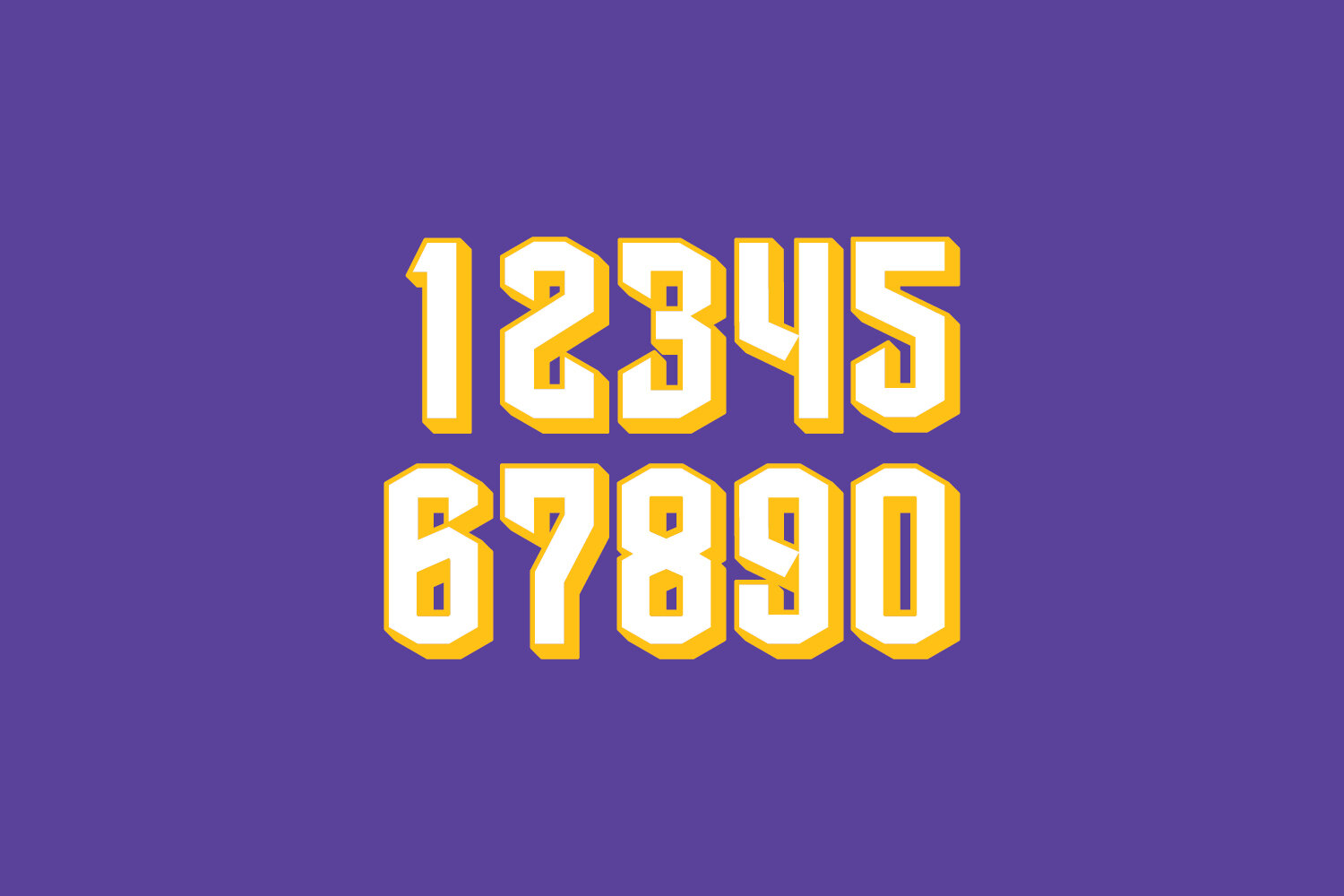
In testing the direction we created a range of typographic options, trying to find the right balance of contemporary and historical. Including a custom blackletter numeral set with sword like terminals, while remaining rooted in athletic type.
One small detail which did survive and was featured on the home and away uniforms is the sabre side stripe on the jersey. A nod to Excalibur, King Arthurs sword.
In the year after the decision to not go in this direction due to blackletter inspiration not quite feeling modern enough, the NBA’s LA Clippers introduced a blackletter uniform to their set.
Purely as a fan of sports design I hope the Sydney Kings revisit the potential in this direction one day.
Case Study: NBL Sydney Kings City Jersey Concept
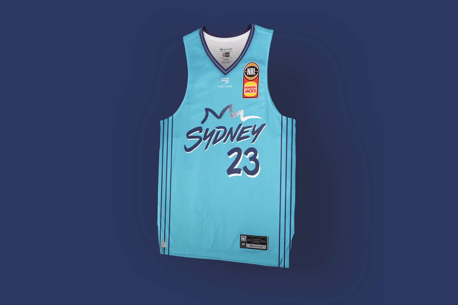
Inspired by Sydney Harbour and Bondi Beach as Australia’s most famous postcard destinations.
One of the highlights of working with First Ever and the NBL to redesign their jerseys and uniform system for the NBL20 basketball season, was undertaking the City uniform concepts.
Inspired by Sydney Harbour and Bondi Beach as Australia’s most famous postcard destinations.
One of the highlights of working with First Ever and the NBL to redesign their jerseys and uniform system for the NBL20 basketball season, was undertaking the City uniform concepts.
The City jersey creates the greatest opportunity to explore and develop unique ideas free from the usual club colour palettes, brand guidelines, and push some less traditional sports design ideas with the goal of creating a basketball uniform with a stronger connection to the lifestyle of a city.
Sydney having one of the strongest colour palettes in the NBL it was always a risk to stray from famous purple and gold, but with the NSW blue also being so popular we wanted to push a direction that would stand out and connect with the fans base.
Inspired by Sydney Harbour and Bondi Beach as Australia’s most famous postcard destinations, the idea was to explore how a Sydney ‘postcard’ could translate to a basketball uniform.
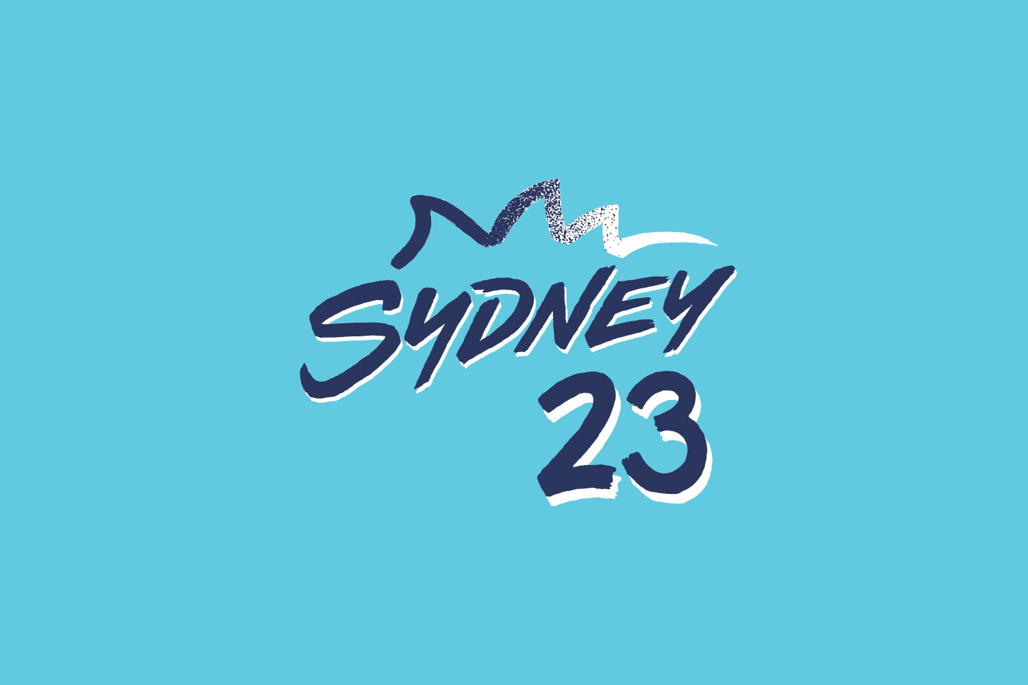
A custom expressive postcard-esque wordmark influenced by iconic imagery, such as Australian artist Ken Done and the 2000 Olympic logo, partnered with some stippled blue to white Bondi surf within the Opera House graphic, and even Icebergs lap lanes are referenced subtly in the pinstripes down both sides of the jersey.
Custom typography and numeral typeface were created but ultimately not used when this design didn’t get selected by the club.
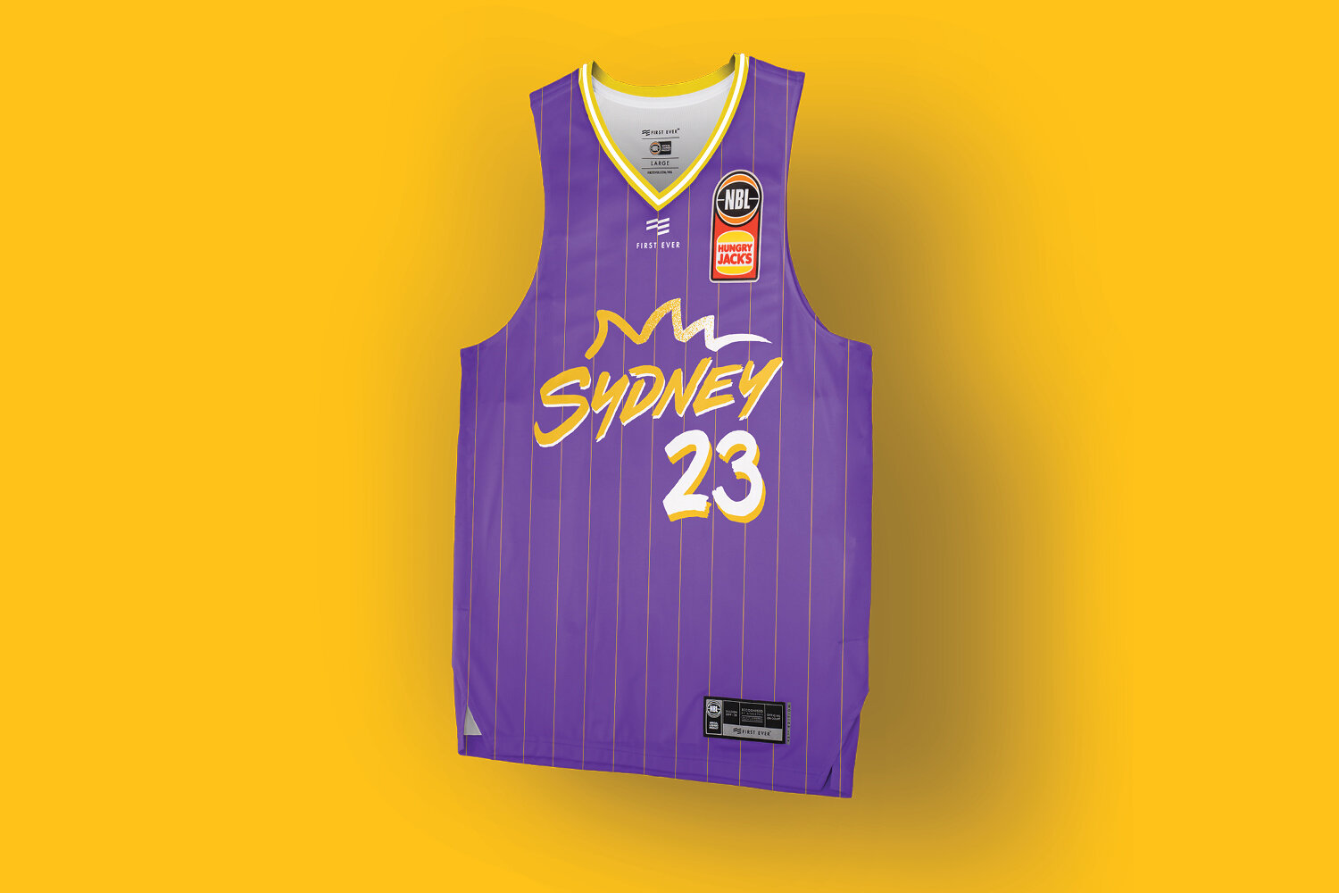
An alternate version was also explored with traditional colours and a historical pinstripe.


