Case Study: NBL Sydney Kings City Jersey Concept
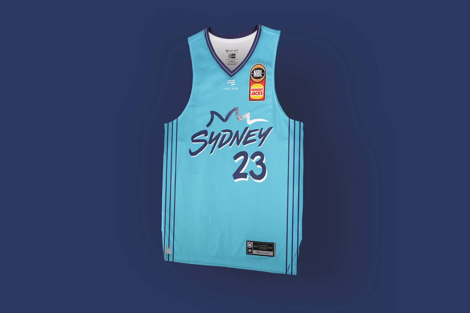
Inspired by Sydney Harbour and Bondi Beach as Australia’s most famous postcard destinations.
One of the highlights of working with First Ever and the NBL to redesign their jerseys and uniform system for the NBL20 basketball season, was undertaking the City uniform concepts.
The City jersey creates the greatest opportunity to explore and develop unique ideas free from the usual club colour palettes, brand guidelines, and push some less traditional sports design ideas with the goal of creating a basketball uniform with a stronger connection to the lifestyle of a city.
Sydney having one of the strongest colour palettes in the NBL it was always a risk to stray from famous purple and gold, but with the NSW blue also being so popular we wanted to push a direction that would stand out and connect with the fans base.
Inspired by Sydney Harbour and Bondi Beach as Australia’s most famous postcard destinations, the idea was to explore how a Sydney ‘postcard’ could translate to a basketball uniform.
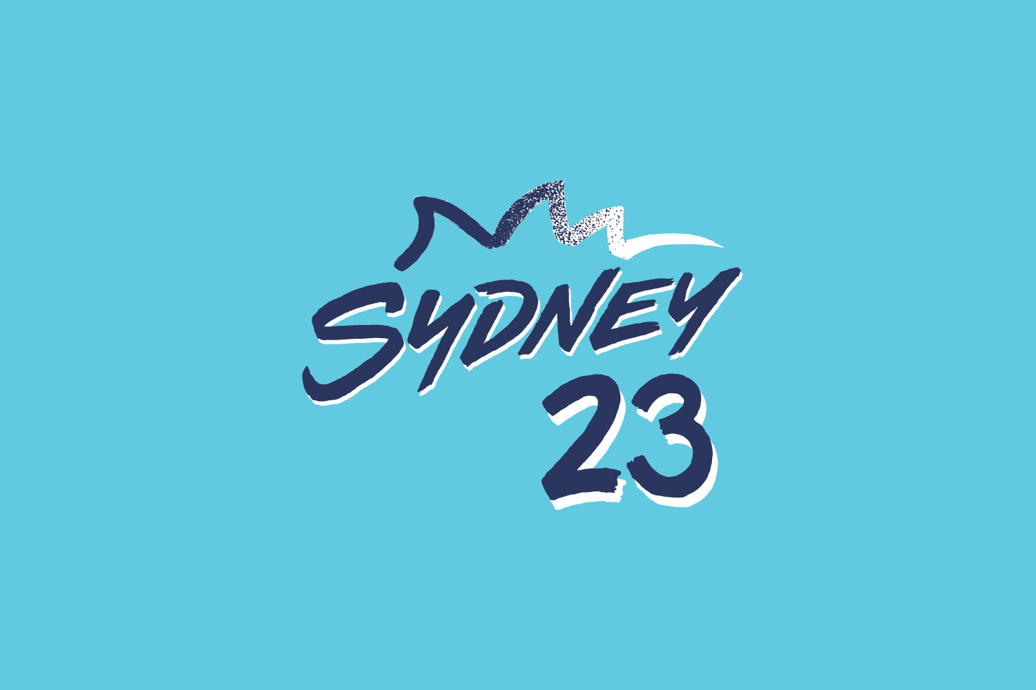
A custom expressive postcard-esque wordmark influenced by iconic imagery, such as Australian artist Ken Done and the 2000 Olympic logo, partnered with some stippled blue to white Bondi surf within the Opera House graphic, and even Icebergs lap lanes are referenced subtly in the pinstripes down both sides of the jersey.
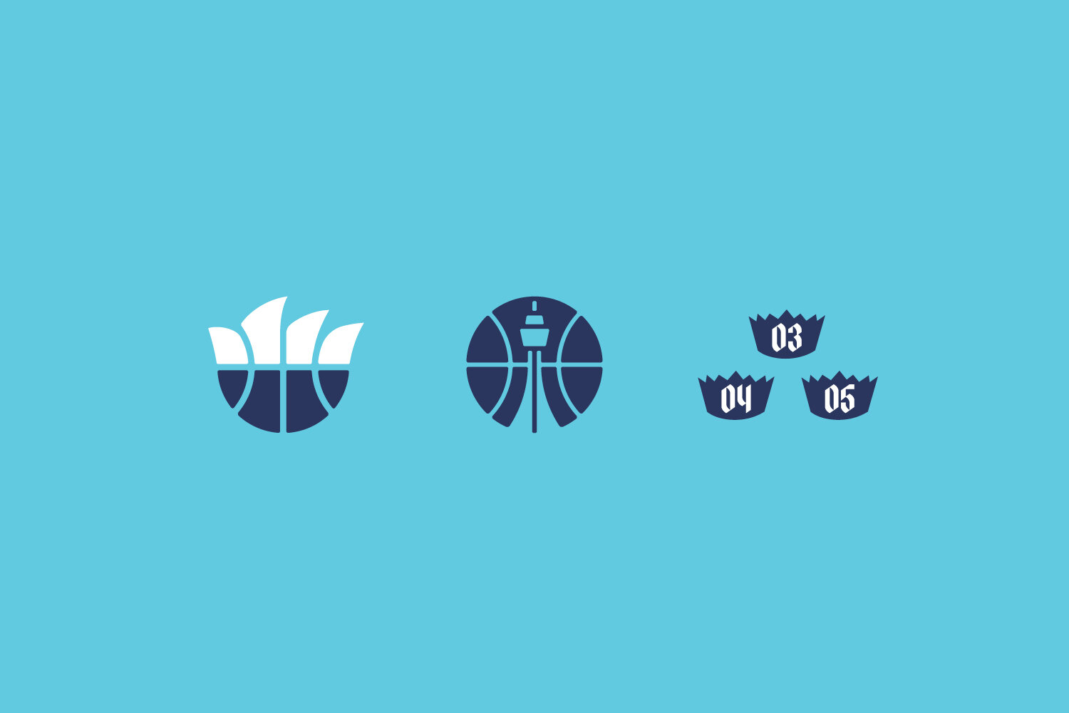
Custom typography and numeral typeface were created but ultimately not used when this design didn’t get selected by the club.
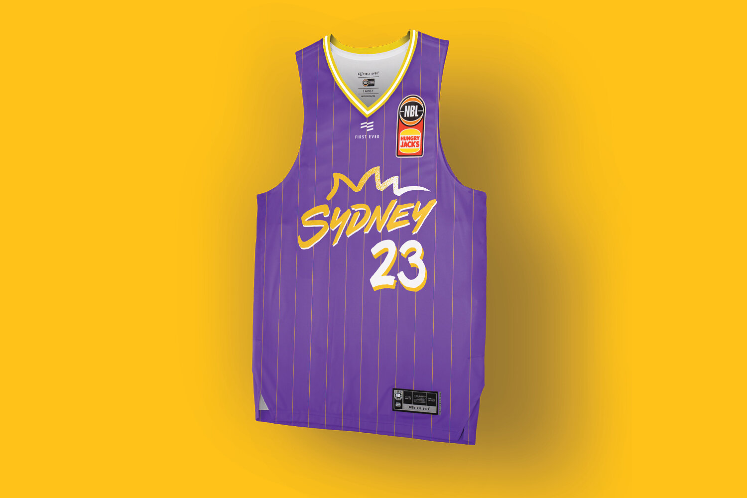
An alternate version was also explored with traditional colours and a historical pinstripe.

