Case Study: NBL Sydney Kings Blackletter Jersey Concept
Heading to battle with the Sydney Kings and blackletter inspired uniforms.
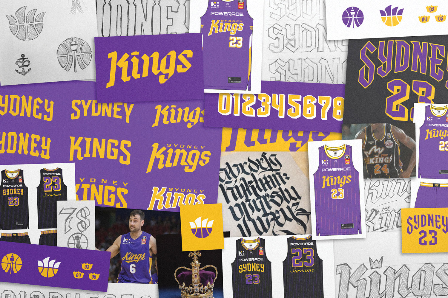
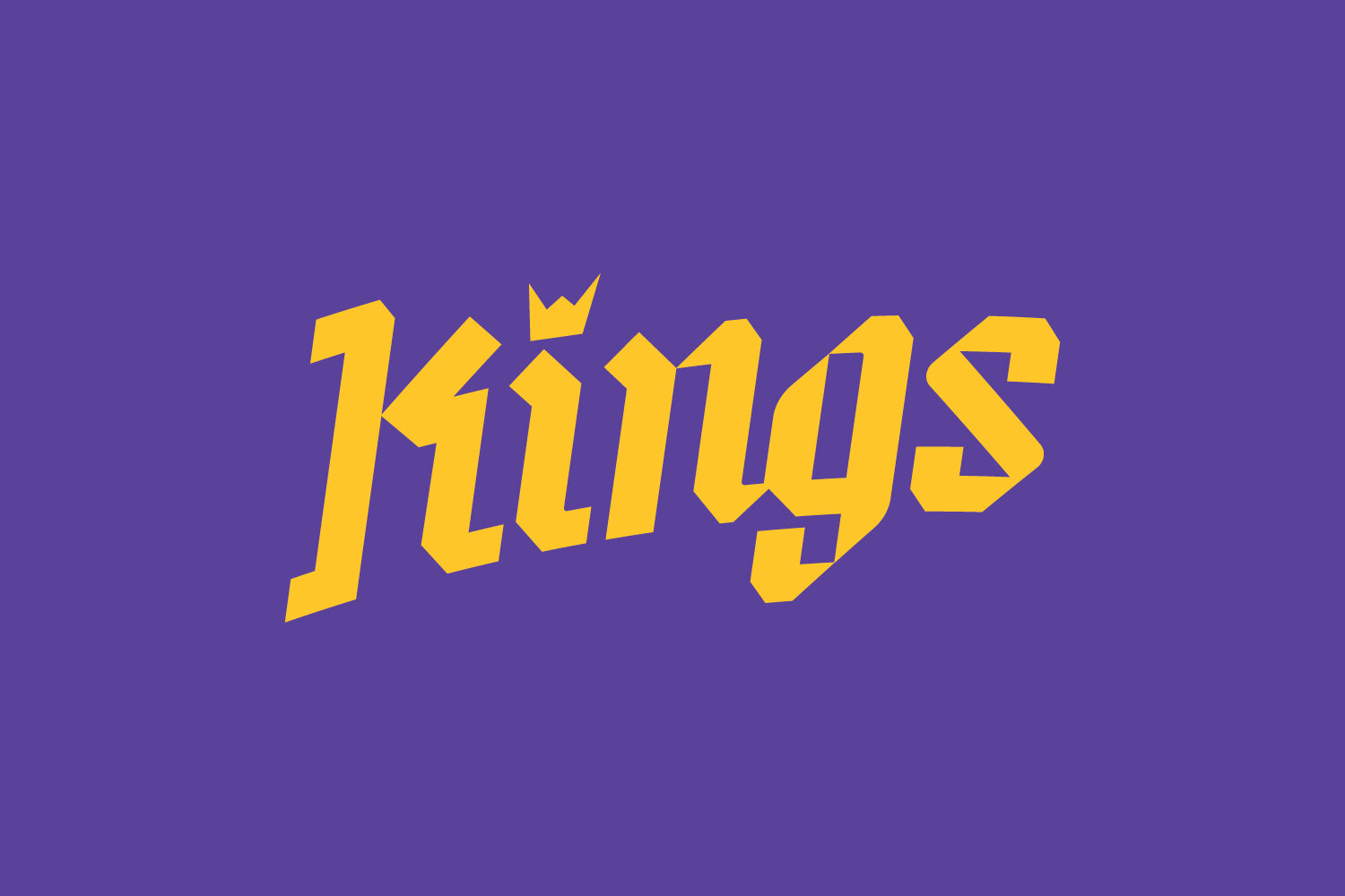
Early in the design process for the NBL 20 uniforms we identified potential for the Sydney Kings uniform design to amplifies the ‘Kings’ part of their brand identity, and develop typography which would be fairly unique in the global sporting landscape.
The name Kings evokes such a rich reference palette of medieval ideas, battles, ruling lands, extreme wealth, sword fights and black letter typography.
Admittedly theres a danger if not properly executed it could resemble a LARP guild more than a modern basketball franchise, but there in lied the challenge.
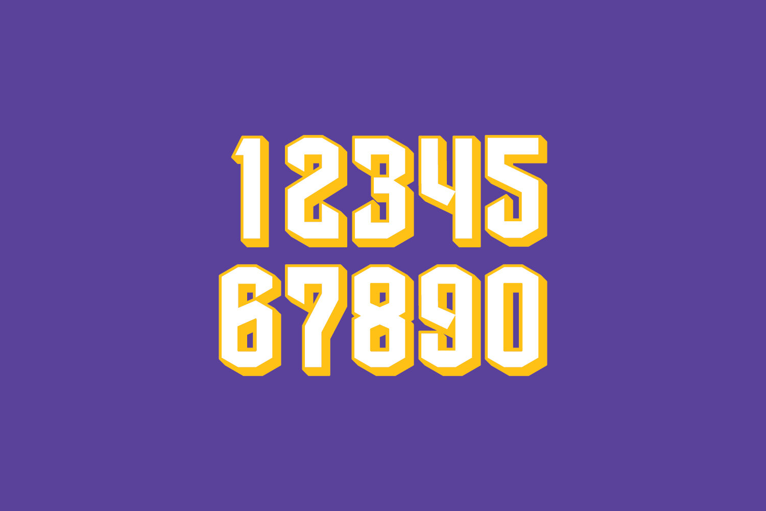
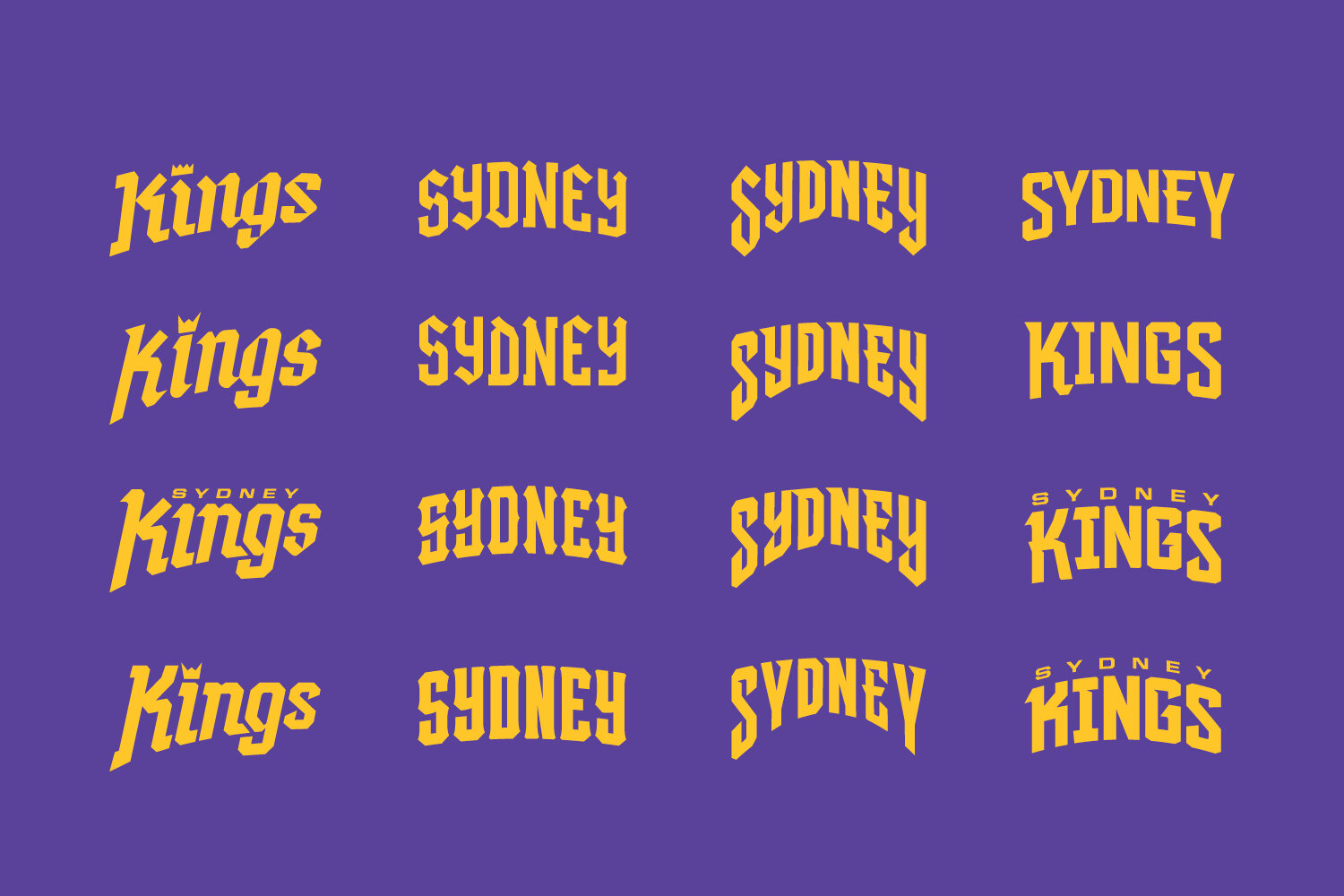
In testing the direction we created a range of typographic options, trying to find the right balance of contemporary and historical. Including a custom blackletter numeral set with sword like terminals, while remaining rooted in athletic type.
One small detail which did survive and was featured on the home and away uniforms is the sabre side stripe on the jersey. A nod to Excalibur, King Arthurs sword.
In the year after the decision to not go in this direction due to blackletter inspiration not quite feeling modern enough, the NBA’s LA Clippers introduced a blackletter uniform to their set.
Purely as a fan of sports design I hope the Sydney Kings revisit the potential in this direction one day.


