Case Study: NBL Melbourne United City Jersey Concept
Melbourne’s laneway culture takes court.
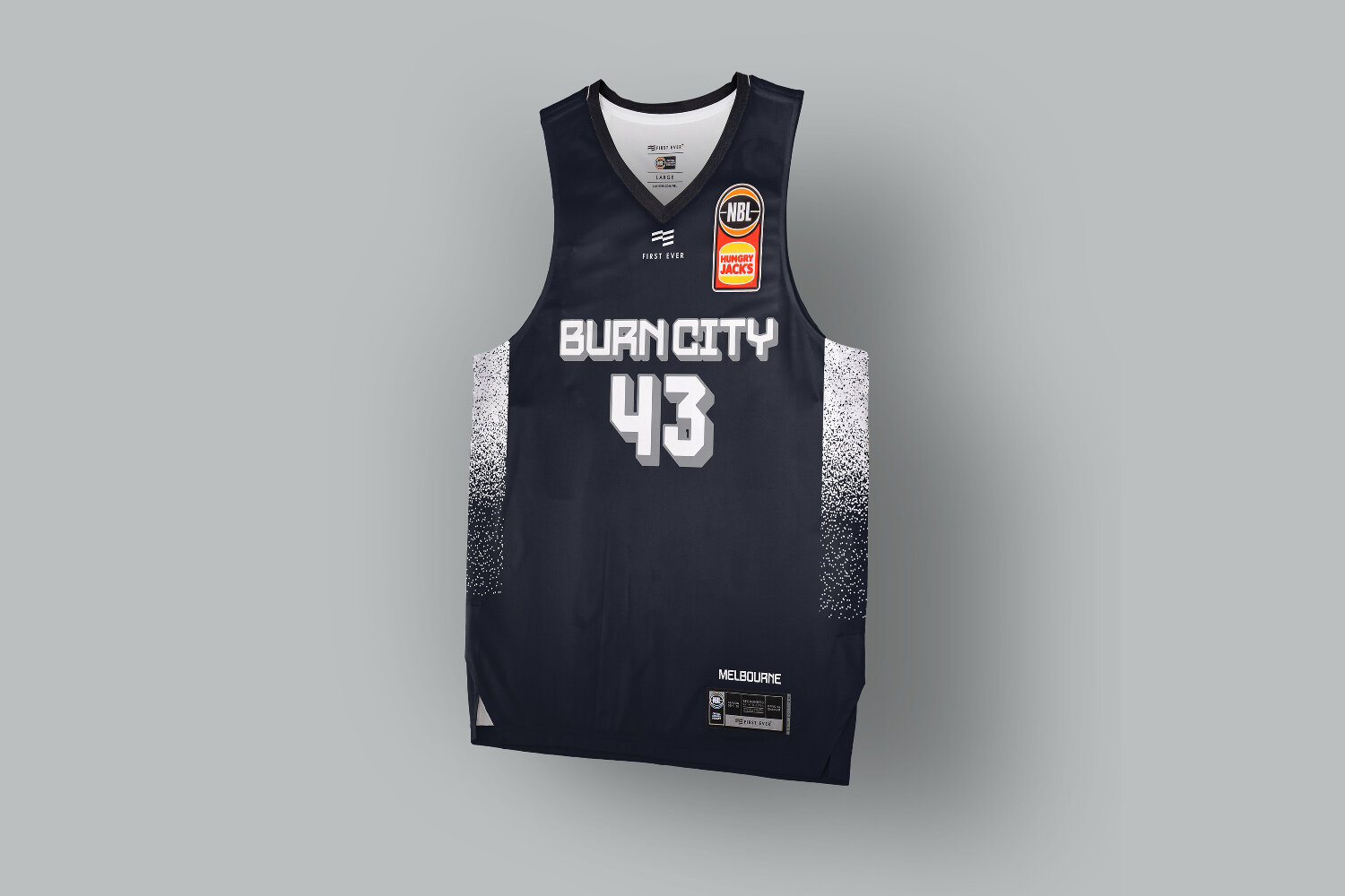
Using Melbourne’s laneway culture as a conceptual starting point for Melbourne United’s city uniform design was high on the priority list of creative directions to explore.
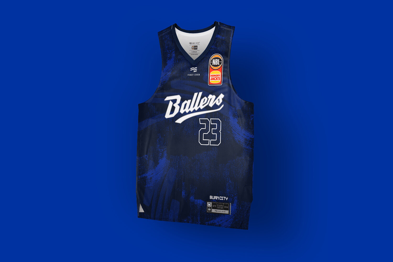
Finding a harmonious balance that could be part street grime and graffiti, with a hint of coffee, while still being somewhat native to the basketball court definitely has it’s challenges.
Typographically using a throwie and tag style always looks super toy when implemented by a large brands or teams on uniforms or supporters apparel. Even if they get a renowned artist they still find a way to mess it up by trying to make it commercial.
With that in mind the decision was made pretty early on that a large blockbuster style would be a better reference point and have a more natural synergy with basketball typography.
The other alternate was a athletic script which appeared to be built from metal, much like the chrome badges on coffee machines found in the same Melbourne graffiti covered laneways.
The ‘Ballers’ moniker is something which gets referenced at Melbourne United game intros, and their store is ‘Ballers Store’ so its somewhat of a unofficial nickname which gets used. This was looking to test if they’d ever elevate that to their primary jersey wordmark.
Ultimately this is preliminary work which got cut short, but would have loved to work with some local writers on creating some the type for this.


