Archa Credit Card
Over the last 12 months we’ve been working closely with Australian fin-tech Archa so it is a super exciting moment to get their first business credit cards hot off the press.
Over the last 12 months we’ve been working closely with Australian fin-tech Archa so it is a super exciting moment to get their first business credit cards hot off the press.
Their partnership with Mastercard and the features the team has been packing into the product offering will change the expectations and relationship businesses have with their line of credit. Looking forward to the next 12 months and beyond with these guys.
This neo-credit card is truely just the beginning.
Venice Ball Freedom Jam
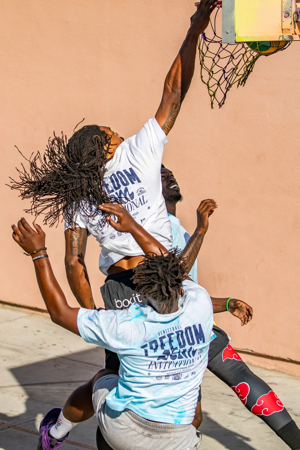
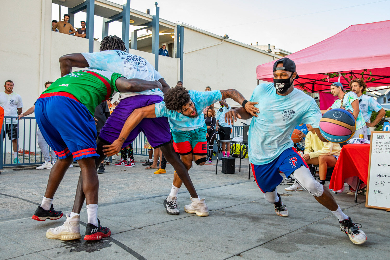
In the midst of Black Lives Matter marches and the first wave of Covid-19 outbreaks our LA friends behind the Venice Basketball League organised the Venice Ball Freedom Jam.
In the midst of Black Lives Matter marches and the first wave of Covid-19 outbreaks our LA friends behind the Venice Basketball League organised the Venice Ball Freedom Jam.
An invitational 2 on 2 basketball tournament held along the Venice boardwalk using positive energy to raise the spirits while parks were locked down and people were searching for an outlet.
Tee’s served both as uniforms for players participating in the tournament, and as merch available for sale during and after the event.
Garment design was a collaboration with graphics being completes by us and Boris Franz doing the heavy lifting on site with the tie dye execution and all event photography.
Stay safe, wear a mask!
The Philly Pledge Brand Identity
When Covid-19 hit, it caused the entire world to change how we live and work. It cause us to rethink how we approach and solve design problems.
When Covid-19 hit, it caused the entire world to change how we live and work. It cause us to rethink how we approach and solve design problems. When previously lead times were afforded to test ideas and challege directions, in the grip of a global pandemic expediency becomes paramount, especially when the goal is to help those most exposed in a time of crisis.
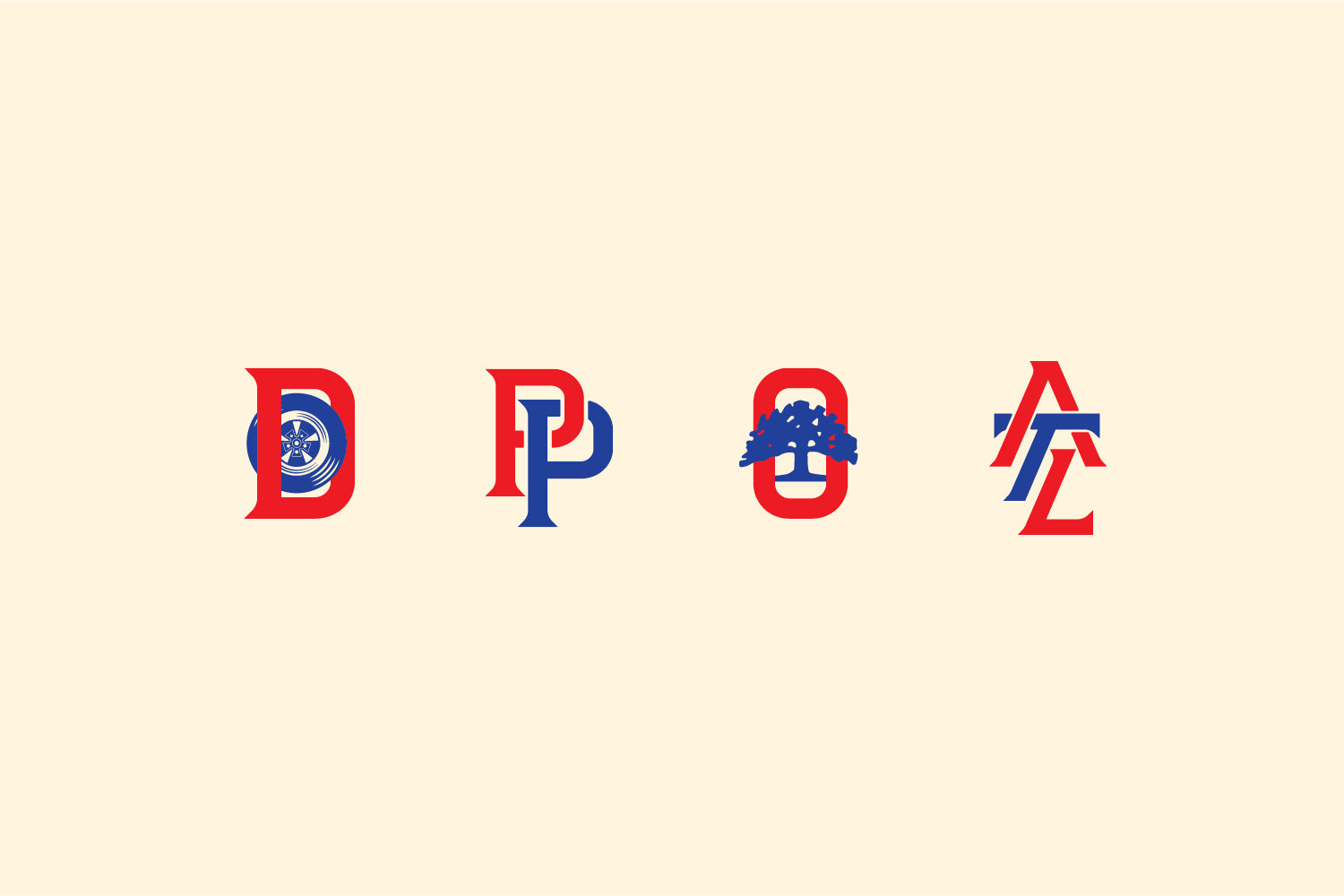
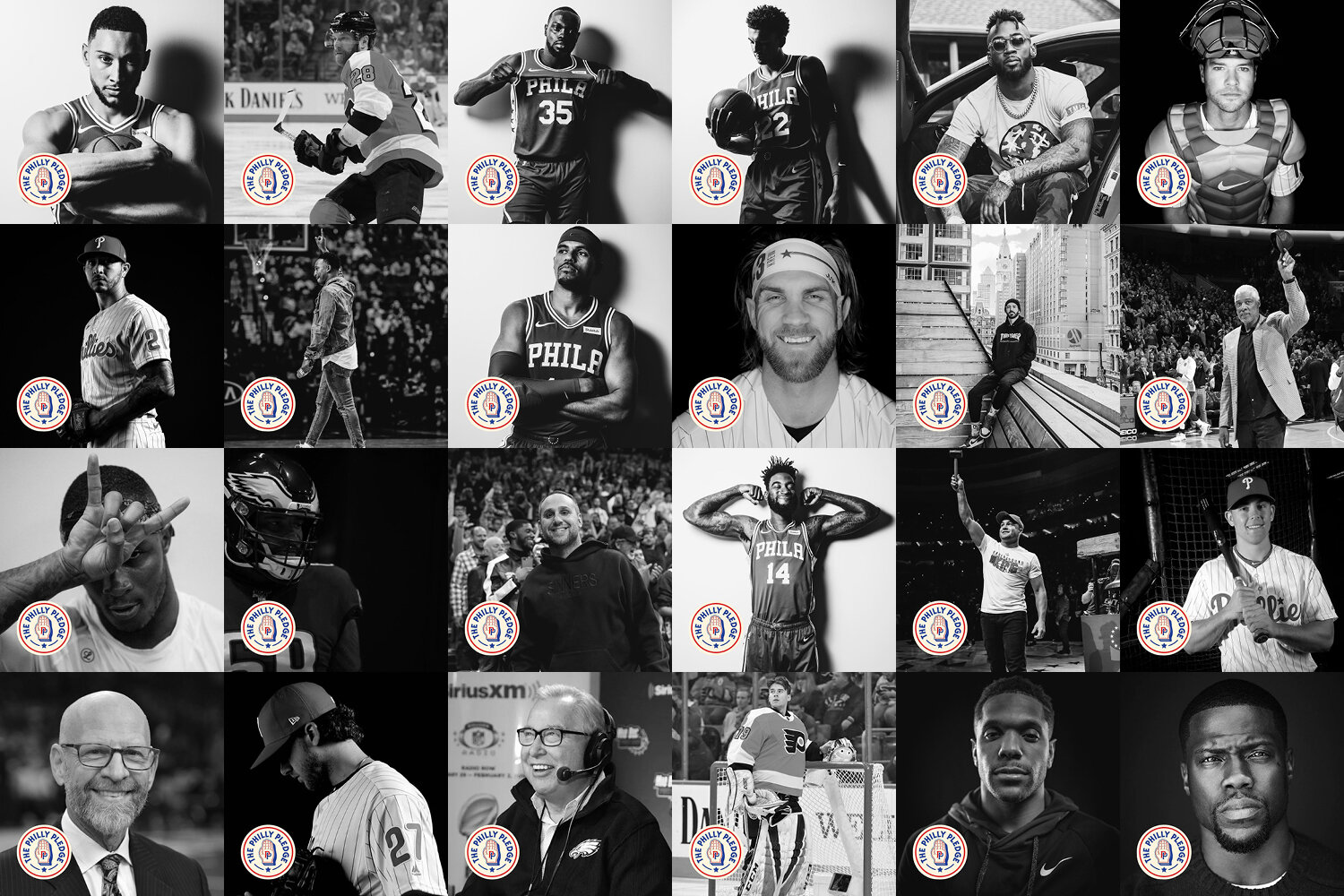
Enter The Philly Pledge. A charity initiative started by Ben Simmons and his team, the goal was to create a one stop platform which funned donors to a selection of preferred charities who have the infrastructure to immediately and directly impact those in need.
Leveraging Ben’s platform combined with media, many other Philly natives and athletes, getting something up fast was key. Working quickly, juggling Philadelphia and Melbourne timezones, literally working at both ends of the clock, within 48 hours of our first phone call we had a logo and a basic website live for The Philly Pledge.
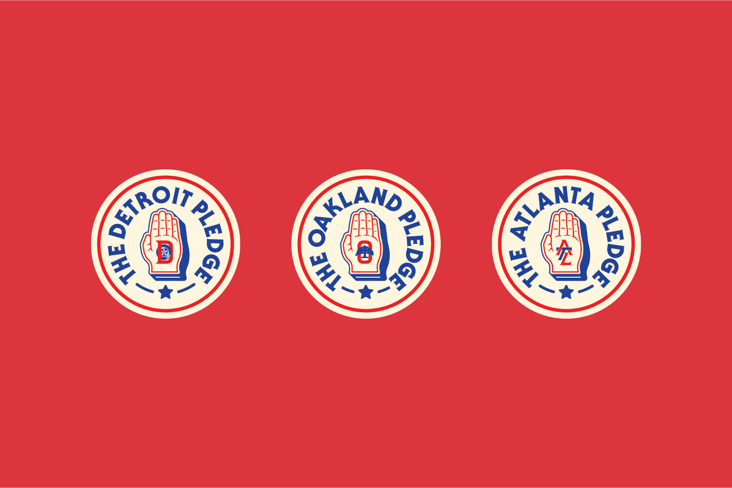
The success of The Philly Pledge meant we were able to expand the initiative to other cities, launching Detroit, Atlanta and Oakland in the following weeks, all linked to their own charities with direct ties to the communities.
Paulie Walnuts Pizza Tee
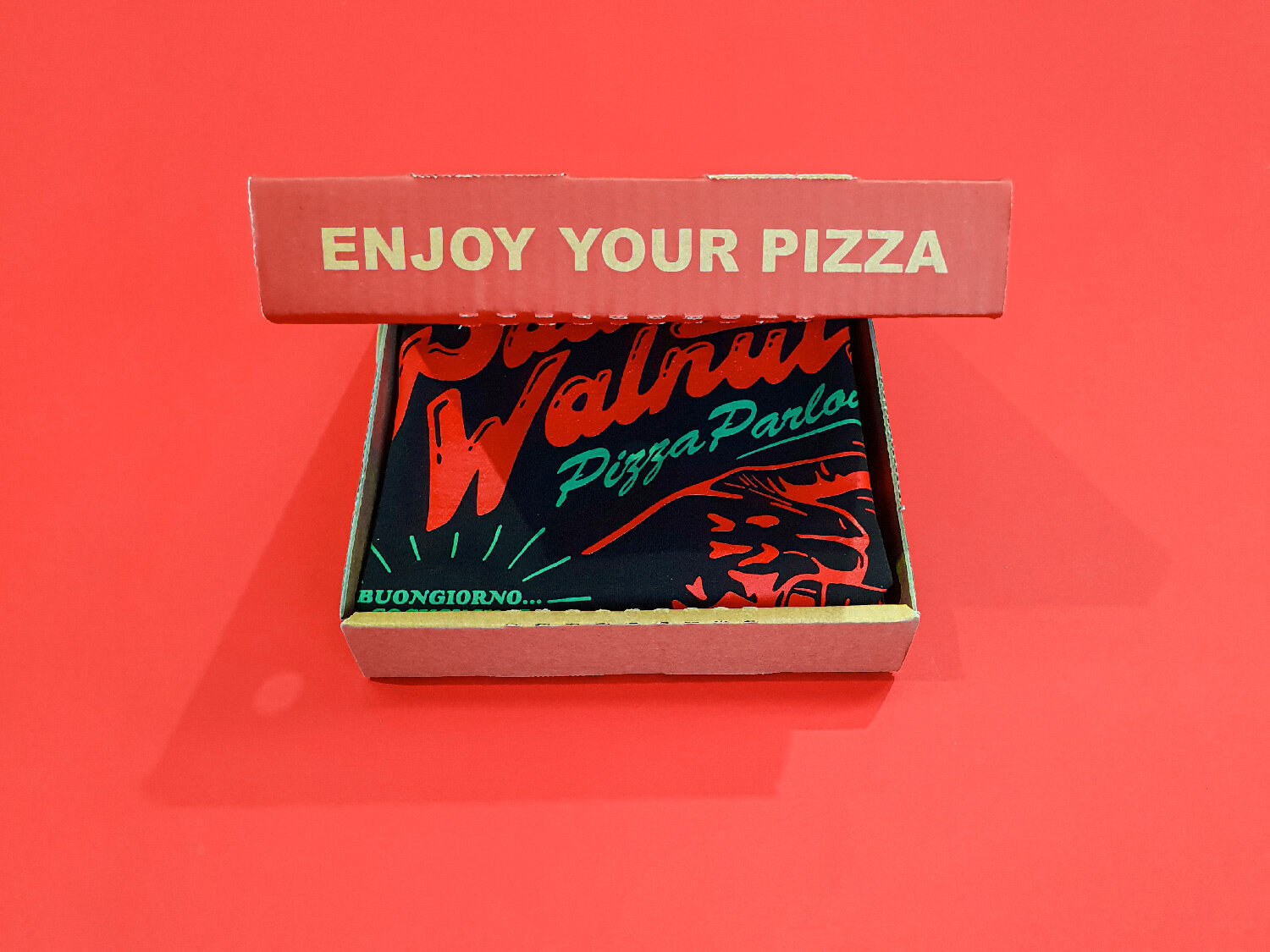
A t-shirt collaboration with Marcos Diaz (aka Digable Goods, aka Hasta La Vista Club) celebrating Paulie Walnuts, born out of Molto Bene issue one — Pizza Edition.
Right as the Melbourne was being shut down during Covid-19 and many freelance creatives were losing projects as clients cautiously adapted to the world in front of us. Marcos Diaz (aka Digable Goods, aka Hasta La Vista Club) pulled together a group of Australian designers, illustrators and tattoo artists to create a suite of imaginary pizza graphics for issue one of his Molto Bene zine.
As people settled into isolation and begun re-bingeing classic tv, Sopranos chatter started to peak again. Following in the vein of many pizza shops named after real and fictional mobsters I decided to honor my personal favorite from the show Paulie ‘Walnuts’ Gualtieri.
After the zines quickly disappeared we printed a limited run of tees, shout out High Tees Screen printing, packaged them up in pizza boxes, shout out Royal Standard Hotel, and sent them off.
Good fun project to be in the mix with some super talented people. Thanks to everyone that copped a tee.
Check out
Hasta La Visa Club
Digable Goods
High Tee Screen Printing
Case Study: NBL Melbourne United City Jersey Concept
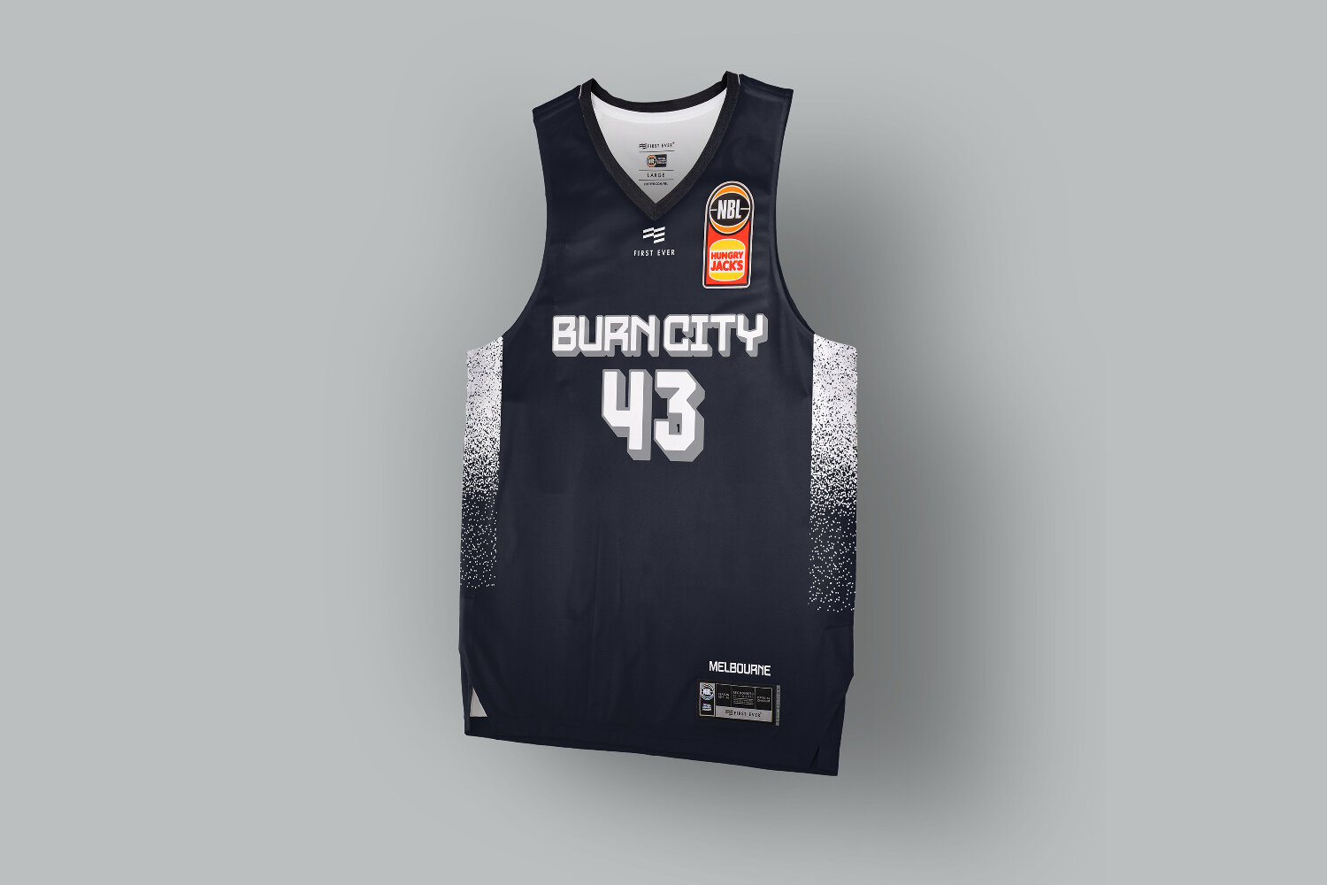
Using Melbourne’s laneway culture as a conceptual starting point for Melbourne United’s city uniform design was high on the priority list of creative directions to explore.
Melbourne’s laneway culture takes court.
Using Melbourne’s laneway culture as a conceptual starting point for Melbourne United’s city uniform design was high on the priority list of creative directions to explore.
Finding a harmonious balance that could be part street grime and graffiti, with a hint of coffee, while still being somewhat native to the basketball court definitely has it’s challenges.
Typographically using a throwie and tag style always looks super toy when implemented by a large brands or teams on uniforms or supporters apparel. Even if they get a renowned artist they still find a way to mess it up by trying to make it commercial.
With that in mind the decision was made pretty early on that a large blockbuster style would be a better reference point and have a more natural synergy with basketball typography.
The other alternate was a athletic script which appeared to be built from metal, much like the chrome badges on coffee machines found in the same Melbourne graffiti covered laneways.
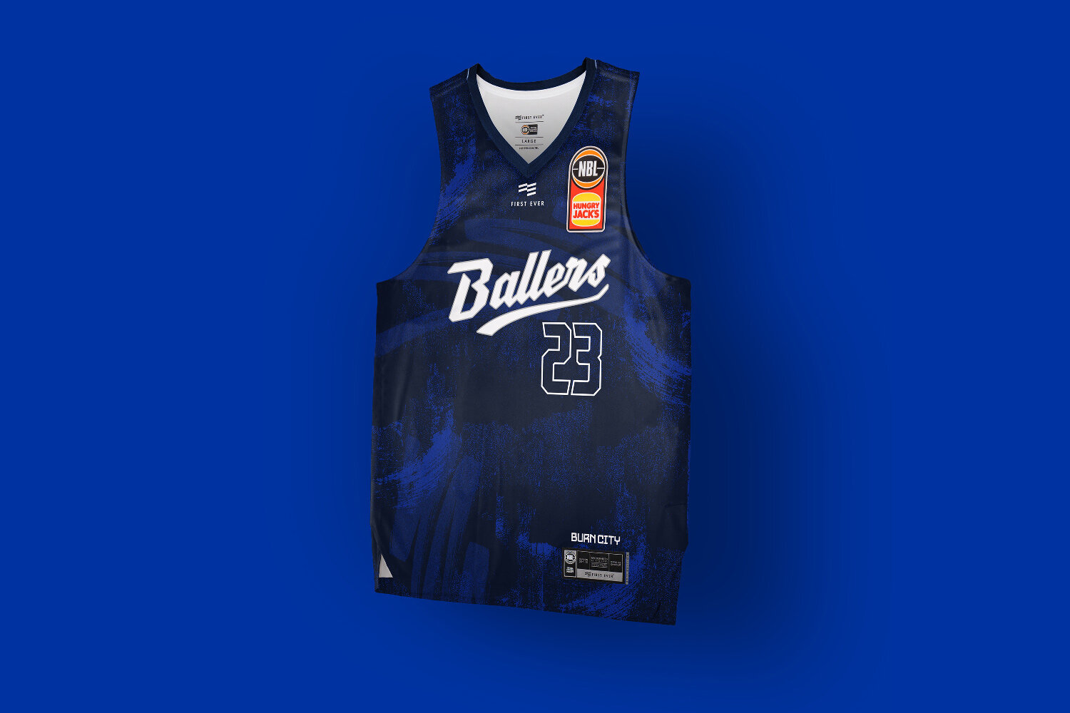
The ‘Ballers’ moniker is something which gets referenced at Melbourne United game intros, and their store is ‘Ballers Store’ so its somewhat of a unofficial nickname which gets used. This was looking to test if they’d ever elevate that to their primary jersey wordmark.
Ultimately this is preliminary work which got cut short, but would have loved to work with some local writers on creating some the type for this.
Case Study: NBL Brisbane Bullets City Flag Jersey Concept
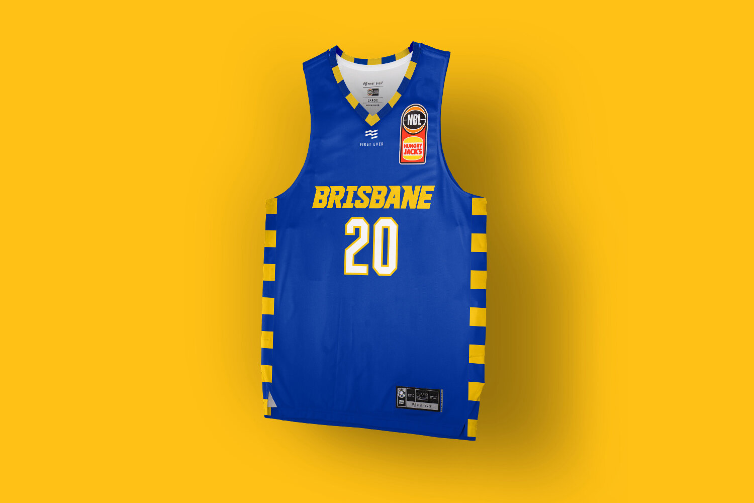
Flying the flag for Queensland’s capital. Before starting the research for this project I had no idea what the Brisbane flag looked like.
Flying the flag for Queensland’s capital.
Before starting the research for this project I had no idea what the Brisbane flag looked like. Turns out it is one of the most unique flags in Australia, with no tired visual ties colonial flags.
Theres a couple odd elements in it, hello pretzels, but the colour palette and patterning is so fresh and striking we had to try incorporate into a City jersey concept.
Throughout the process multiple wordmark variations were explored, from simple and robust modern sport, to fast with a bit of throwback edge, but the flag trim was a mainstay having it utilised in various combinations of type and base fabric colours.
While the flag colours are a perfect match for the teams brand identity, ultimately this was a little too close for what the club was looking for.
Wanting to offer something more unique in an alternate colour palette for the supporters who already own so many blue, yellow and white basketball jerseys, we eded up going down the route of the black and white Skyline uniforms. Check out the link below.
Case Study: NBL Sydney Kings Blackletter Jersey Concept
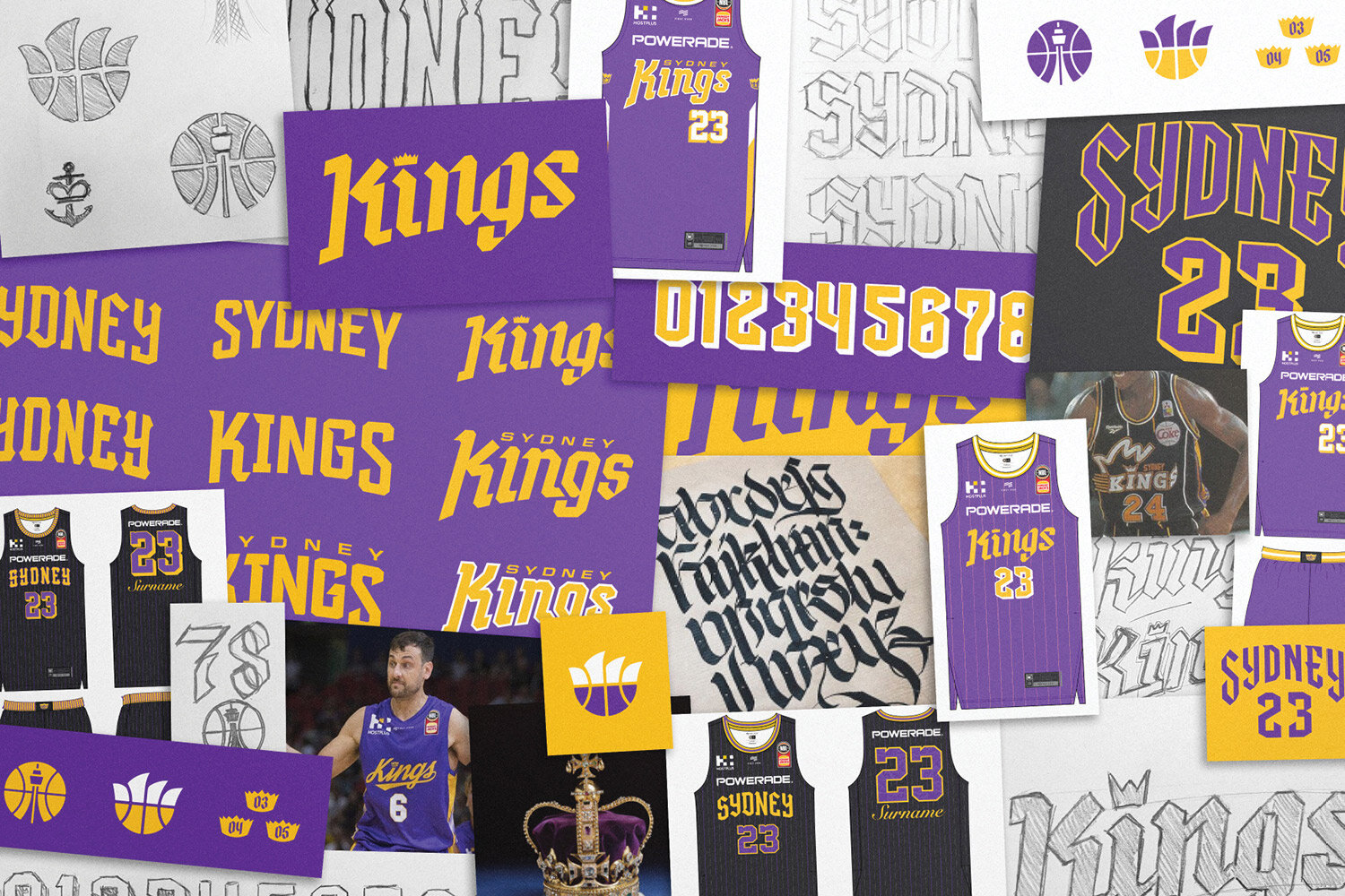
Early in the design process for the NBL 20 uniforms we identified potential for the Sydney Kings uniform design to amplifies the ‘Kings’ part of their brand identity, and develop typography which would be fairly unique in the global sporting landscape.
Heading to battle with the Sydney Kings and blackletter inspired uniforms.
Early in the design process for the NBL 20 uniforms we identified potential for the Sydney Kings uniform design to amplifies the ‘Kings’ part of their brand identity, and develop typography which would be fairly unique in the global sporting landscape.
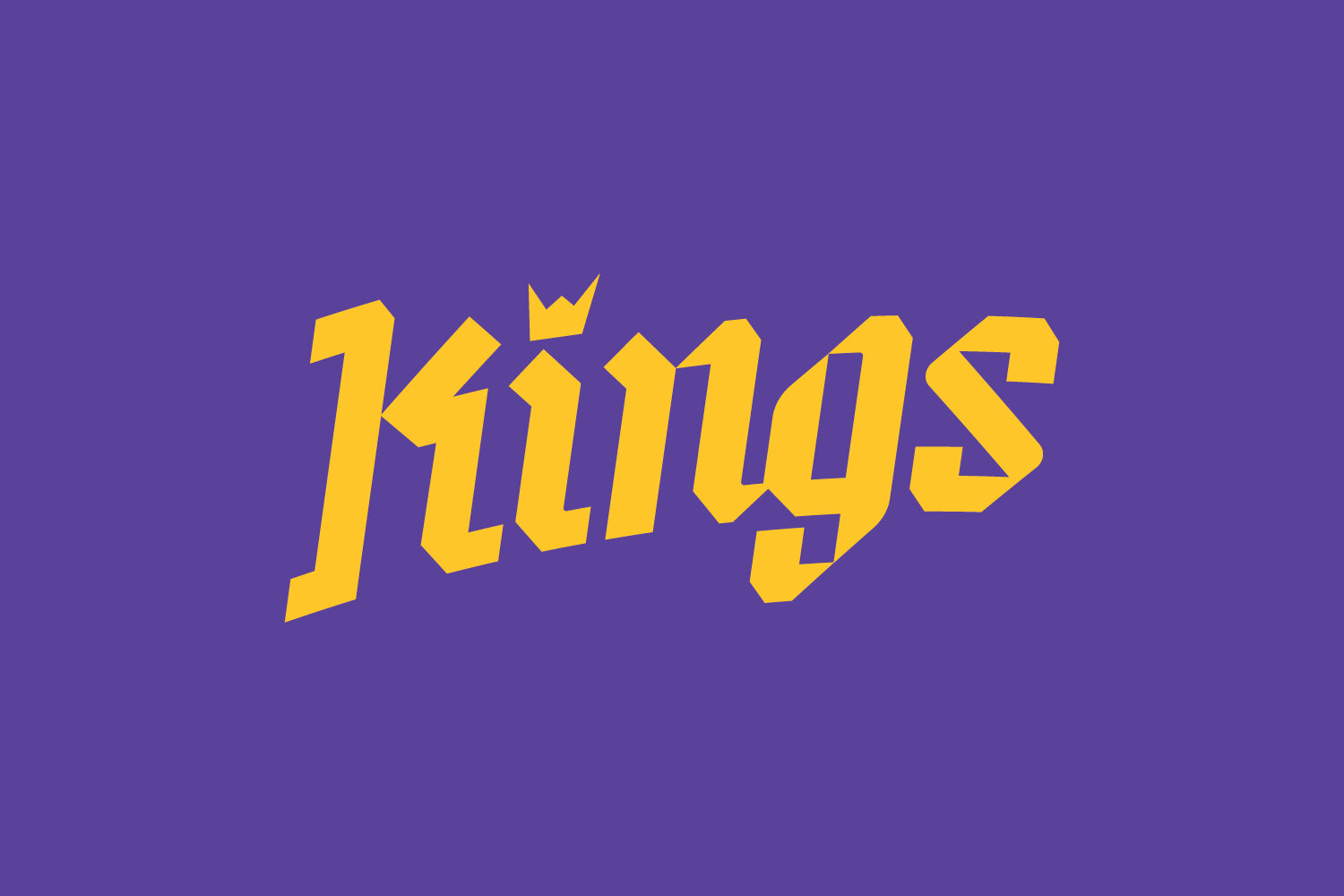
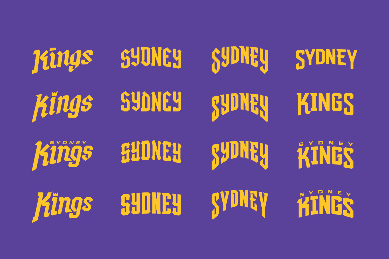
The name Kings evokes such a rich reference palette of medieval ideas, battles, ruling lands, extreme wealth, sword fights and black letter typography.
Admittedly theres a danger if not properly executed it could resemble a LARP guild more than a modern basketball franchise, but there in lied the challenge.
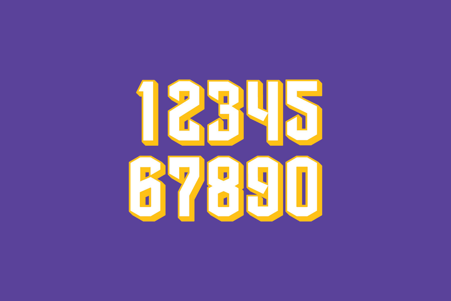
In testing the direction we created a range of typographic options, trying to find the right balance of contemporary and historical. Including a custom blackletter numeral set with sword like terminals, while remaining rooted in athletic type.
One small detail which did survive and was featured on the home and away uniforms is the sabre side stripe on the jersey. A nod to Excalibur, King Arthurs sword.
In the year after the decision to not go in this direction due to blackletter inspiration not quite feeling modern enough, the NBA’s LA Clippers introduced a blackletter uniform to their set.
Purely as a fan of sports design I hope the Sydney Kings revisit the potential in this direction one day.
Case Study: NBL Sydney Kings City Jersey Concept
Inspired by Sydney Harbour and Bondi Beach as Australia’s most famous postcard destinations.
One of the highlights of working with First Ever and the NBL to redesign their jerseys and uniform system for the NBL20 basketball season, was undertaking the City uniform concepts.
Inspired by Sydney Harbour and Bondi Beach as Australia’s most famous postcard destinations.
One of the highlights of working with First Ever and the NBL to redesign their jerseys and uniform system for the NBL20 basketball season, was undertaking the City uniform concepts.
The City jersey creates the greatest opportunity to explore and develop unique ideas free from the usual club colour palettes, brand guidelines, and push some less traditional sports design ideas with the goal of creating a basketball uniform with a stronger connection to the lifestyle of a city.
Sydney having one of the strongest colour palettes in the NBL it was always a risk to stray from famous purple and gold, but with the NSW blue also being so popular we wanted to push a direction that would stand out and connect with the fans base.
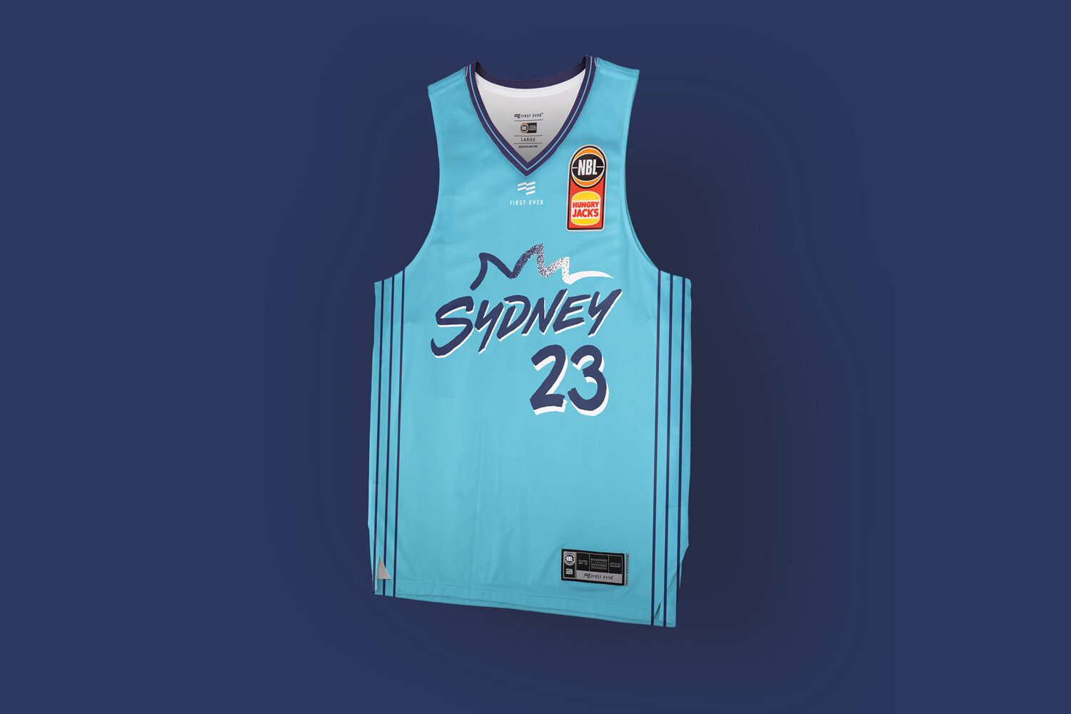
Inspired by Sydney Harbour and Bondi Beach as Australia’s most famous postcard destinations, the idea was to explore how a Sydney ‘postcard’ could translate to a basketball uniform.
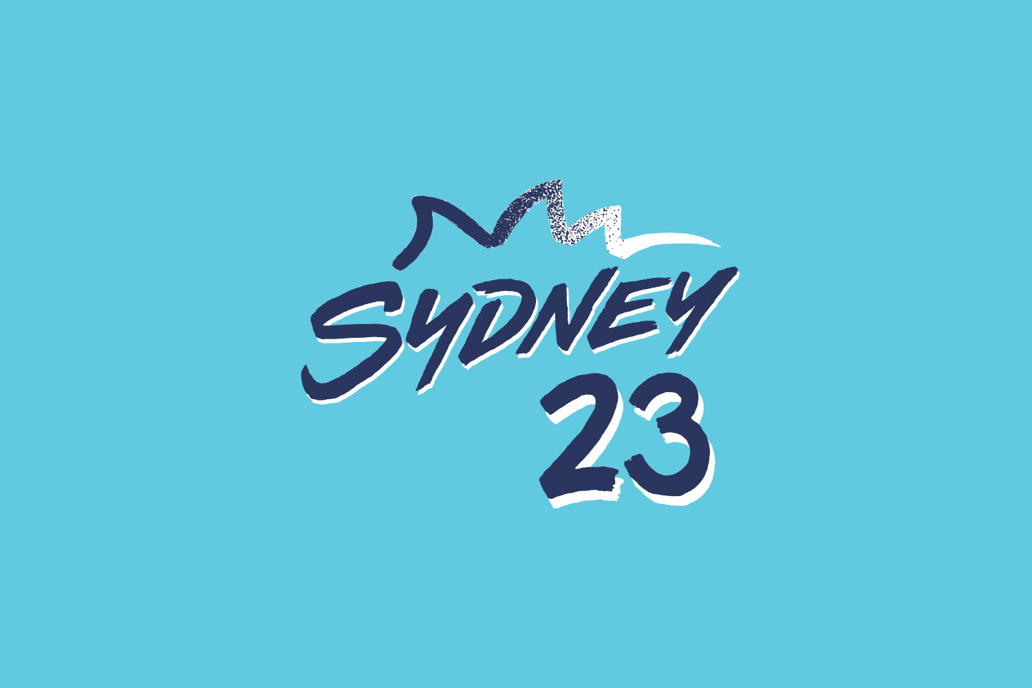
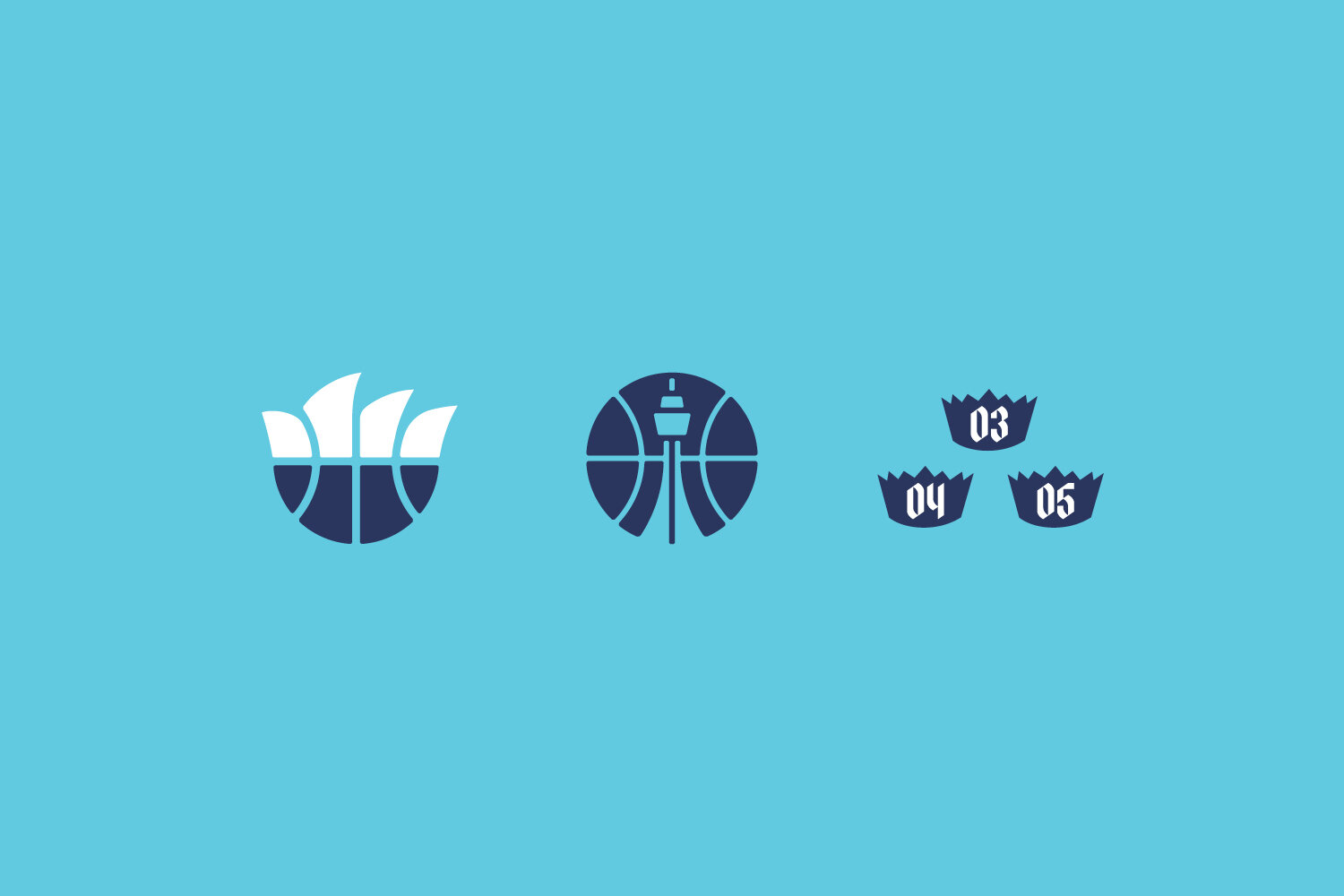
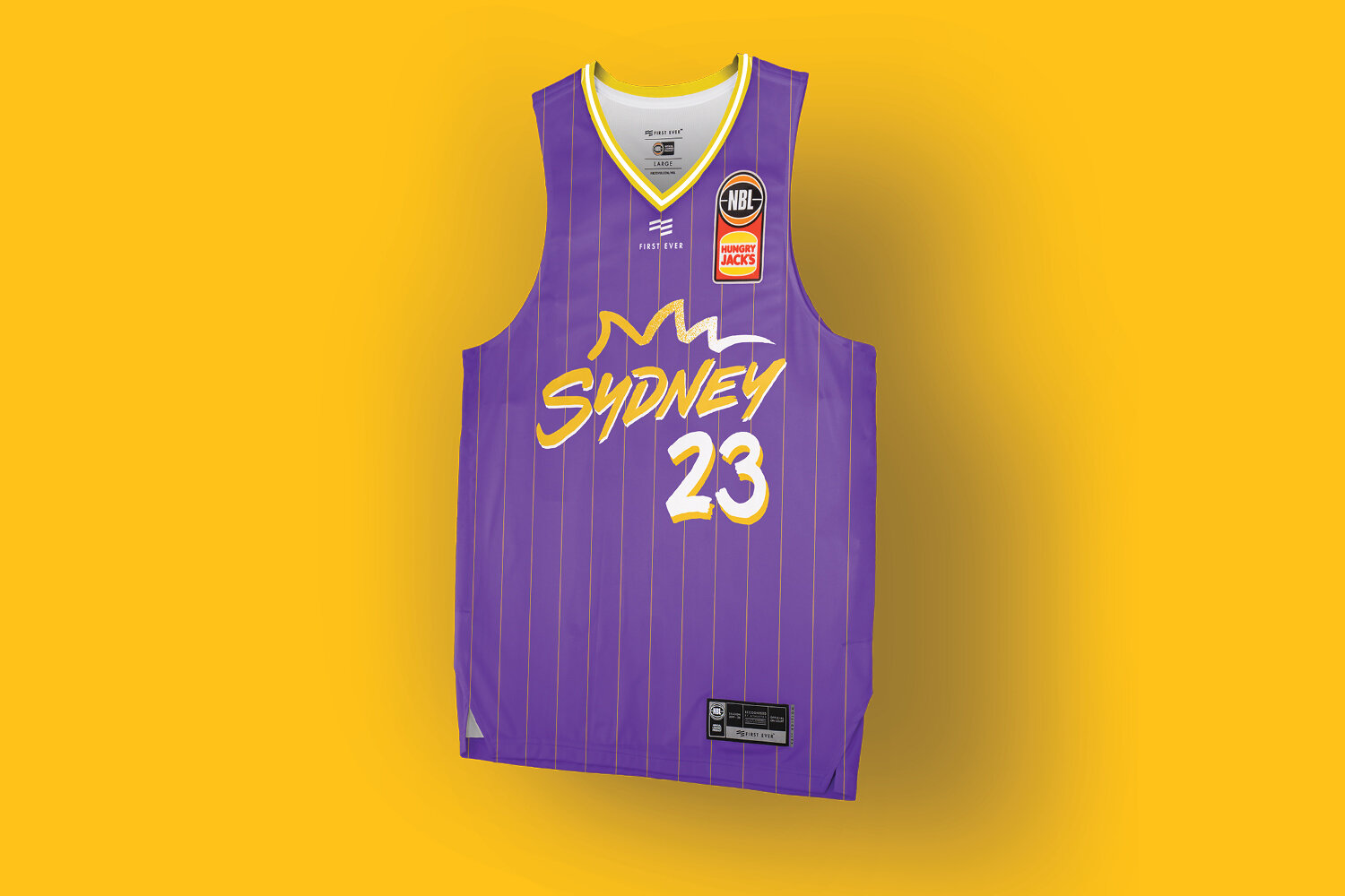
A custom expressive postcard-esque wordmark influenced by iconic imagery, such as Australian artist Ken Done and the 2000 Olympic logo, partnered with some stippled blue to white Bondi surf within the Opera House graphic, and even Icebergs lap lanes are referenced subtly in the pinstripes down both sides of the jersey.
Custom typography and numeral typeface were created but ultimately not used when this design didn’t get selected by the club.
An alternate version was also explored with traditional colours and a historical pinstripe.


